Thursday, December 17, 2015

Papa Murphy's Site Selection

Introduction:

This assignment was an extension from the previous lab that was completed related to retail site selection. This project allowed the student to pick a particular store that interested them and perform analysis needed to locate a new location for a particular store. Since there was no actual customer data provided, it was up to the student to develop the different parameters that would be used for analysis. The goal was to use all of the skills developed throughout the semester for the final project. This is a hypothetical situation, but all the analysis performed would be utilized in the site selection process.

Case Study:

Papa Murphy's Take 'n' Bake pizza is looking to expand their presence in area surrounding Rochester, MN. There are currently two stores located in the city. As the city of Rochester, MN expands, Papa Murphy's sees an opportunity to expand their business within the region. Since Rochester, MN is much larger than many of the surrounding towns, many people travel there to shop, for entertainment or employment. The study area (Figure 1) used for this case study consisted of Dodge, Olmsted, Winona, Wabasha and Goodhue counties.

Figure 1. This map shows the greater study are for developing a new Papa Murphy's Store.
The red box within the study area shows the specific area of where a new store could be developed. 
Although the larger study area consisted of 5 counties in southeastern Minnesota, the specific area where prospective stores would be located are in the red box within the study area. This box encompasses Rochester, MN and all of the major roadways leading into the city. 

The first factor that used was to create a trade area. Since many of Papa Murphy's customers will most likely be driving the drive times from the current Papa Murphy's stores in Rochester is important. These drive times show how far a person can travel in any direction away from the store. The figure below (Figure 2) shows the drive time rings around the stores. 

Figure 2. This maps shows the different drive times from the two Papa Murphy's that
are currently in Rochester, MN. 
The rings were designed not to overlap, and there were three different classifications used: 5 minutes, 10 minutes and 15 minutes. Since Papa Murphy's is known for their freshly made pizza you take home and bake yourself, it was important to be accessible to many people. The time rings were developed based on the amount of time people may be willing to drive to pick up a pizza. These rings are most relevant to people that live within the city or in close proximity. People traveling to the city from farther distances may not travel strictly for pizza, but may be more inclined to stop if is is on their way out of town. 

Another important factor used to potentially find a new site was to locate competitor stores. The map below (Figure 3) shows the locations of potential competing stores. 

Figure 3. This map shows the location of the different competitors of Papa Murphy's.
Although the make up of these stores are different, they are still selling the same product. Most of the competitors are located along the major roadways leading in and out of town. They are more concentrated in the central and northwest parts of Rochester, MN. Knowing where the competing stores are located allows for a company to potentially fill an area that is not saturated with places that sell pizza. 

The next important factor to look at is the customer base that will be targeted. Since there was no customer data provided, the student had to develop their own guidelines in helping them find a new site. The three guidelines used to find ideal customers in this lab were household income, household size and population. These numbers were found at the census tract level, and the guidelines created were set at:

      Median Household income: Between 45,000 - 85,000
      Tract Population: 2,000 - 10,000
      Median Household Size: 2.0-5.0

Once these guidelines were set, analysis could then be ran to determine which census tracts met the criteria for ideal customers. The map below (Figure 4) shows the results of which census tract has the ideal customer base. 

Figure 4. This map shows the census tracts that have the ideal customer base.
It also shows the prospective sites for a new store to be developed. 

Also included in Figure 4 are the prospective site locations. These sites were chosen by the student based on all of the analysis performed. Once the sites were selected, the student then needed to rank them. Business Analyst was used to rank the perspective site locations. The tool "Rank Similar Site" was used in order to find the best site compared to the existing site locations within Rochester, MN. When using the tool, different parameters can be set in order to develop a more accurate model. The different factors included, 2015 total population, 2015 median household income, 2015-2020 growth rate: population, 2020 average family size and fast food/drive-in last 6 months at Papa Murphy's. Business Analyst takes these different factors and determines which numbers are significant. It then takes those significant results to rank the different perspective site locations. The map below (Figure 5) shows the results of ranking each point.

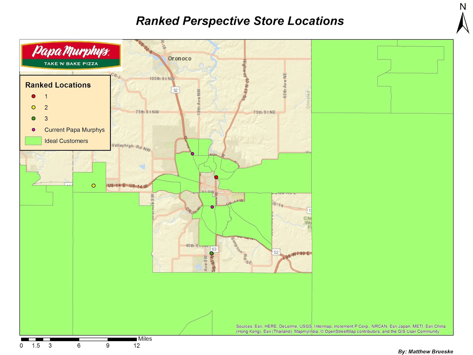
Figure 5. This map shows the ranking for each of the perspective sites. 

After locating where a new store should be built, a final factor had to be used in order to determine marketing ideas, such as advertisements for the new business. This final factor is called the point of indifference. This point signifies the point at which people become indifferent in which city or geographical direction they traveled for a particular good. The formula used is shown below (Figure 6).

Figure 6. This is the formula used to find the point of indifference between two cities. 
This formula compares the distance between each city to the population. The end result is the distance in miles to the point of indifference. In this study, three different cities were compared to Rochester, MN. The three cities and their point of indifference are listed below:

      -Austin, MN          29 Miles
      -Winona, MN        30 Miles
      -Owatonna, MN    27 Miles 

These distances could represent the distance marketers should send out advertisements or the distance people are willing to travel for a particular good.

Conclusion:

As shown in the many figures above, there is opportunity for expanding Papa Murphy's in Rochester, MN. Not only does the city have a growing population to support expansion, there are many people that travel there from out of town who could frequent a new establishment. The location of a new store is key to its success and there were a few options presented that will help the franchise continue to grow.

Wednesday, December 2, 2015

Retail Site Selection

Introduction: 

When deciding to build a new retail store, location is critical to the success of a business. If a business is not placed in an ideal location it could have a very negative affect. The store must be near the target customer base and typically the more people living around a store will increase the chances of having more sales. The location criteria varies depending upon the type of retail store as well as who the target customers are. The purpose of this lab is to showcase the different things necessary for successful retail site selection.

Case Study:

This particular case study will be looking at putting a new Trader Joe's in the area surrounding Minneapolis and St. Paul Minnesota. The customer data used was created by the instructor given to us to use. This case study is a hypothetical situation designed to give the student a background in retail site selection. The goal of this lab is to go through the different important factors that influence the location of a new store and then use Business Analyst to come to a final conclusion.

Figure 1. This is the study area used to find a new location
for a Trader Joe's in Hennepin and Ramsey counties. 


The first step in finding an ideal location is to narrow down your study area. In this particular case study, the study are will be Hennepin and Ramsey counties in Minnesota. These two counties encompass Minneapolis and St. Paul, which is where Trader Joe's would like to develop a new store. The map to the left (Figure 1) shows the study area with the other Trader Joe's stores already in operation.


The next step is to determine the market penetration of the stores that are currently in operation. Market penetration compares the number of customers to a particular variable, total population is typically used as the variable. This lets a company know if they are doing well with the population living in a particular area or if there is room for improvement. The figure below (Figure 2) shows the market penetration for Trader Joe's stores.


Figure 2. This map shows the market penetration
that Trader Joe's currently has in the study area. 
Based off of this map, the darker the green, the greater Trader Joe's is doing in that particular area. This analysis used zip codes as the defined geography. There were more zip codes than what is actually shown. The reason there are fewer now is the zip codes were grouped by the name of each city. Grouping by a city name, instead of strictly zip code, allows for a company to find what cities in particular they are reaching.
Figure 3. This map shows what areas of the city
are the most densely populated. 

The next step is to do a hot spot analysis and look at the population of the study area. Hot spot analysis identifies areas that have a high proportion of a particular variable at a specified geographic scale. In this study, each grid square is 0.5 miles by 0.5 miles. As the map to the right shows (Figure 3), the most densely populated areas are around the central and east central areas of the study area.


The next step was to locate where the ideal customers for Trader Joe's lived. There can be multiple variables chosen in order to locate a specific demographic group. Similar to market penetration, the geography used for analysis can be changed. Zip codes were used again in this example. For this study, the two variables selected were total population and median household income. Within the variables chosen, floor and ceiling values can be set. This allows for a very specific demographic to be identified. After this tool is run, a layer is produced with the results. Since this example uses zip codes, if a zip code area is showing on the map, that means there is a high number of your ideal customers living in that geographic area. The map to the left (Figure 4) shows the ideal customers.


The final step is to run the rank site tool. After looking at all of the different analysis results, the user is able to choose multiple different sites to be ranked by Business Analyst. In this example, three different sites were chosen and then ranked. When the sites are being ranked, different variables can be used to help the program make the best decision on where the new store should be located.


Conclusions:

The ranking of a potential store location is shown in Figures 2, 3 and 4. As is shown, the most ideal location for a new Trader Joe's is located in the eastern portion of the study area. This area is surrounded by an ideal customer base as well as a fairly high population. As shown in figure 2, it is in an area where Trader Joe's is already doing well. Although it may saturate the market slightly, it also has the ability to pull other customers from outside of the study area.


Wednesday, November 4, 2015

Real Estate Analysis

Introduction:

When it comes to selling and purchasing houses in a given area there are many factors. Often times knowing the area around the house in a given area is just as important as knowing the property itself. Realtors have to come up with a selling strategy most fitting for the given area and target buyers who fit that strategy the best. Buyers, especially people looking at purchasing investment properties also have to come up with a strategy that is good for their business. These buyers are not purchasing so much for themselves and what they like in a property but more so what they think others will like and be willing to shell out monthly rent to live there.

Case Study:

In the case of our property, 234 Roosevelt Ave. this situation is no different. We are selling a 4 bedroom, 2.5 bathroom home in the Third Ward very close to the UW - Eau Claire campus. The home is over 3,500 sq ft, central cooling and forced air heat, has garage parking for 3 vehicles and is a minute walk away from being on campus. In other words, everything a group of students could want and more.
A house like this is highly sought after by students who want to live off campus but not necessarily feel like they are living in a typical rental property. Which opens up other opportunities. With a property like this you are not limited to just students. Other properties for rent in the area are bareboned, out of date and not necessarily family friendly. This house would be perfect for a family new to the area who wants the downtown experience without fully committing to home ownership.
To establish what kind of strategy we decided to use we had to look at the Third Ward as a whole as well as the surrounding area. To do so we used Business Analyst by ESRI and extension of ArcMap. We established a couple of things. In the Third Ward there are over 450 Renter Occupied Units (Figure 1).

Renter_Occupied.jpg
Figure 1. This map depicts the number of renter occupied housing units for the Third Ward and
the surrounding block groups. 

Going off this map alone we can see this is an area students are looking to rent in. Over half the houses in the Third Ward are being rented out, (52%.) We also wanted to see what the median age for the surrounding area was knowing that the college is a minute away. For the area our house is in the median age is 25 (Figure 2).
Median_Age.jpg
Figure 2. This map shows the median age for the Third Ward and the surrounding area. 

This tells us a lot of traditional college aged students live there with maybe some younger families also located in the area.
We also wanted to see how the Third Ward compared to the surrounding area.  In the surrounding area 66% of households are occupied by rents. This area of town is occupied with a pretty significant population of renters.

We were curious to as what “type” of people were occupying the Third Ward and Surrounding Area and fortunately Business Analyst has a feature called Tapestry that lays out the demographic of any area with a brief explanation. Our Third Ward property is located in an area considered “College Towns” and the nearby University is considered “Dorms to Diplomas” (Figure 3).

Tapestry_Group.jpg
Figure 3. This maps shows the dominant Tapestry segment in the Third Ward and surrounding area. 


This group is focused on their education, with 59% being enrolled in college or graduate school. Since many of these people are students, median household income tends to be low. This is due to most of the employed residents only work part time. If they aren’t living in a dorm on campus, this group tends to live in low income apartment rentals off campus. “Dorms to Diplomas” is very similar, this group is focused on their education, with 59% being enrolled in college or graduate school. Since many of these people are students, median household income tends to be low. This is due to most of the employed residents only work part time. If they aren’t living in a dorm on campus, this group tends to live in low income apartment rentals off campus. The last relevant group is the group on the east side of the third ward is known as “Old and Newcomers”. This is a transitional area, with people either just starting their careers or retiring. Educational attainment is above average. Although this is a different age class than the “Dorms to Diplomas” and “College Town”, more than 60% of “Old and Newcomers” are renters.

Summary:

There are many features about this property that make it valuable for people from all walks of life. It would be perfect for a new family starting out, plenty of bedrooms, wonderful interior and located close to many amenities they may desire. Our house is surrounded by people that are accustomed to renting their home, and this home has that potential. It could also easily be converted into a wonderful rental property. Its close proximity to campus, off street parking with two garages would make this desirable to students attending the university. Based off of surrounding rental properties, with similar characteristics, our house could be rented for a base price of $2,000.00 per month. This property has endless options, it is up to you as to what you would like to do with it.


Wednesday, October 7, 2015

Coffee Shops in San Francisco

Introduction:

Two friends each own a coffee shop in San Francisco County, CA. One of the coffee shops is located in the northern part of the county, while the other is located in the southern part of the county. These two friends want to maximize their customers trade area but they don't want to do it at the expense of the other coffee shop. They would like to know who their customers are and where they are coming from. In addition to their customers, these owners would also like to locate where their competitors are located.

Sources and Methods:

In order to get an understanding of what is going on, it is important to know where the customers are coming from to get their coffee. The figure below (Figure 1) shows where all the customers are located in relation to each coffee shop.

Figure 1. This shows the location of both coffee shops as well as the
customers that frequent them. 
For the purpose of this analysis, coffee shop 1 is in the northern part of the county and coffee shop 2 is in the southern part of the county. As would be expected, the mean center is located fairly close to each coffee shop. The mean center is the geographic center of all the customers for each coffee shop. There are a few outliers that may skew this mean center slightly, but by and large, the majority of customers are traveling to the coffee shop that is closest to them.

Once the customer locations are know, it is important to see where competing stores are located in relation to the coffee shops. The figure below (Figure 2) shows the location of the coffee shop's competitors.

Figure 2. This map shows the store locations of competing businesses.
At first glance, it seems that there is a large population of competing stores located in the northeastern portion of the county. The location of these stores will have an impact on coffee shop number 1. West of the coffee shop number 1, the density of competing stores is significantly lower. This is the direction where this store should focus on getting customers. Coffee shop number 2 does not have to compete with nearly as many stores. The amount of competing stores is significantly lower in all directions. Coffee shop number 2 should not have difficulty expanding its customer base in any direction.

Although the customer's location can be useful, it may be more beneficial to create buffers around each coffee shop, showing the percentage of the customer base. The figure below (Figure 3) shows the customer base for each coffee shop.

Figure 3. This map shows where the customer base is for each coffee shop. 
When looking at this map, coffee shop number 2 has a larger area of influence. This map shows a number of things. The first is that the larger area of influence around coffee shop number 2 could be related to the lack of competing stores.. As shown in figure 2, most of the competing stores are in the northeaster portion of the county, not anywhere near coffee shop number 2. Another thing that can be interpreted from this map is that these two friends are not competing for the same customers. There is still room for them to expand their customer base without interfering with the sales of the other store.

The last factor to map out is the walk time for the different distances from the coffee shops. The figure below (Figure 4) shows the different walk distances.

Figure 4. This map shows the walking distance to each coffee shop. 
This figure shows customer base based on distance. Each ring is shown in a distance of miles, but represents the walk time for the customers. So the average time it would take a customers to walk a half a mile is shown by the first ring, and one mile is shown by the second and a mile and a half is shown by the third.

Conclusion:

Although it is important to be able see spatially where your customers are coming from, it is also important to understand the area's demographics. Relating back to figure 3, there are 146,836 people living in the 0-80% ring for coffee shop number 1. There are 160,222 people living in the 0-80% ring for coffee shop number 2. This is important to note because the more people living around your store, the greater chance you have to expand your customer base. The mean household income is also significantly higher around coffee shop number 2. It is roughly $30,000 more than compared to the customer base surrounding store number 1. With this higher amount of income, it may allow for these customers to have more money to spend at local coffee shops.

After looking at all of the different variables, coffee shop number 2 has the greatest chance to expand its customer base. This is largely due to the lack of competition in the surrounding area as well as a growing customer base. Both coffee shops can expand their trading areas without affecting the customer trading route of each other. 

Monday, September 21, 2015

Colorado Springs Business Opportunity

Introduction:

Recently we have been given the opportunity to invest in a new business in Colorado Springs, CO. Although there are many different options, we have narrowed it down to fitting the needs of the youth, catering to the growing population of retirees or the influx of the Hispanic population. All options appear as great investment opportunities, but after some research we found some of the options were better than others.

Sources and Methods:

The first test we ran was creating a population pyramid (Figure 1), which is shown below. It is important to know which group of people has the greatest population, which would increase our opportunity for profit.

Figure 1. This is the population pyramid for Colorado Springs, CO.

As you can see, there seems to be a fairly even split between males and females in Colorado Springs. When looking at the age class breakdown, it is apparent that the greatest population is the younger people, but would not be considered youth. Although it is not the highest population percent, it is staying consistent, which could offer a safe investment for the needs of the youth. The retiree population is significantly smaller than that of younger people. Based solely off of this model, it would be in our best interest to cater to the younger people of the city. Along with the population pyramid, it is important to look at the dependency ratio. The figure below (Figure 2) shows the result of the dependency ratio for Colorado Springs, CO. 

Figure 2. The dependency ratio for Colorado Springs, CO.

The dependency ratio is at 46 percent, which means that there are more working class people in the city, than people that are not working. 

The next statistic that was looked at was the location quotient. This allowed for more specific analysis to be done with different variables that relate to Colorado Springs and the United States as a whole. The table below (Table 1) shows the data that was used in order to find the location quotient. Figure 3 (shown below) is the result of calculating the location quotient. 

Figure 3. Shows the results of the Location Quotient for Colorado Springs, the state of Colorado
as well as El Paso, County, Colorado.
Table 1. This table is the data used to determine
 the location quotient for Colorado Springs, CO. 
 When evaluating the location quotient, it is important to understand what the values mean. If a variable has a value of greater than one, that means it has a higher of concentration of that group in that place compared to the average U.S. city.

After looking at the results for Colorado Springs, the only two variables that proved to have a higher concentration were the population of white people as well as the population of children ranging from 0-14 years of age. Although the location quotient for Hispanic population at the state level proved to be a high concentration, it was below the average for the city of Colorado Springs. Since we are looking for business mainly within the city, this may not be the market to invest in.

The last statistic to look at was the location quotient for the different economic sectors of the city. The table below (Table 2) shows the results of the analysis.

Table 2. Shows the location quotient for the different economic sectors
for Colorado Springs, CO.
This graph shows that many areas of the economy have a higher concentration of jobs compared to the average U.S. city. Although many of them have a higher location quotient, it is important to look at these results compiled with all the other data we have collected this far.

Results:

After analyzing the population pyramid as well as both the location quotient for the population statistics as well as the economic sector data, investing in a business that fits the needs of young children will be the best option. Although they do not have the highest population percentage, the population is growing at a consistent rate. Compared to the average U.S. city, there is a higher concentration of children between the ages of 0-14. Given the above average educational and art jobs in the city, it may draw parents into raising their children in Colorado Springs because of the different educational opportunities.